Introduction to HSB
HSB (Hue, Saturation, Brightness) — the most practical and intuitive color model for UI design, and why black and white are not opposites in it.
What Is HSB and Why Does It Matter?
HSB stands for Hue, Saturation, Brightness — one of many systems used to name individual colors. RGB and hex are more common, but:
“HSB in my opinion, is the most practical and the most intuitive.”
For that reason, HSB is the foundation of the Learn UI Design color system — the way color will be taught and used throughout this course.
Setting it up in Figma: Pick any layer, go where RGB or hex is shown, and slide down to HSB. You now have three numbers (plus opacity as a fourth, simpler value).
The Three Properties
graph LR
    HSB["HSB Color Model"]
    H["Hue<br/>0 – 360°<br/>Position on the color wheel"]
    S["Saturation<br/>0 – 100%<br/>Amount of color injected"]
    B["Brightness<br/>0 – 100%<br/>How much the light is on"]
    HSB --> H
    HSB --> S
    HSB --> B
Hue
Hue is a number from 0 to 360 — literally the degrees of a circle, where the circle is the color wheel. It represents which color of the rainbow you’re closest to.
- 0 (and 360) = pure red — they are exactly the same thing, no difference
- 120 = green (centered)
- 240 = blue (centered)
Red, green, and blue split the wheel into three equal 120° segments.
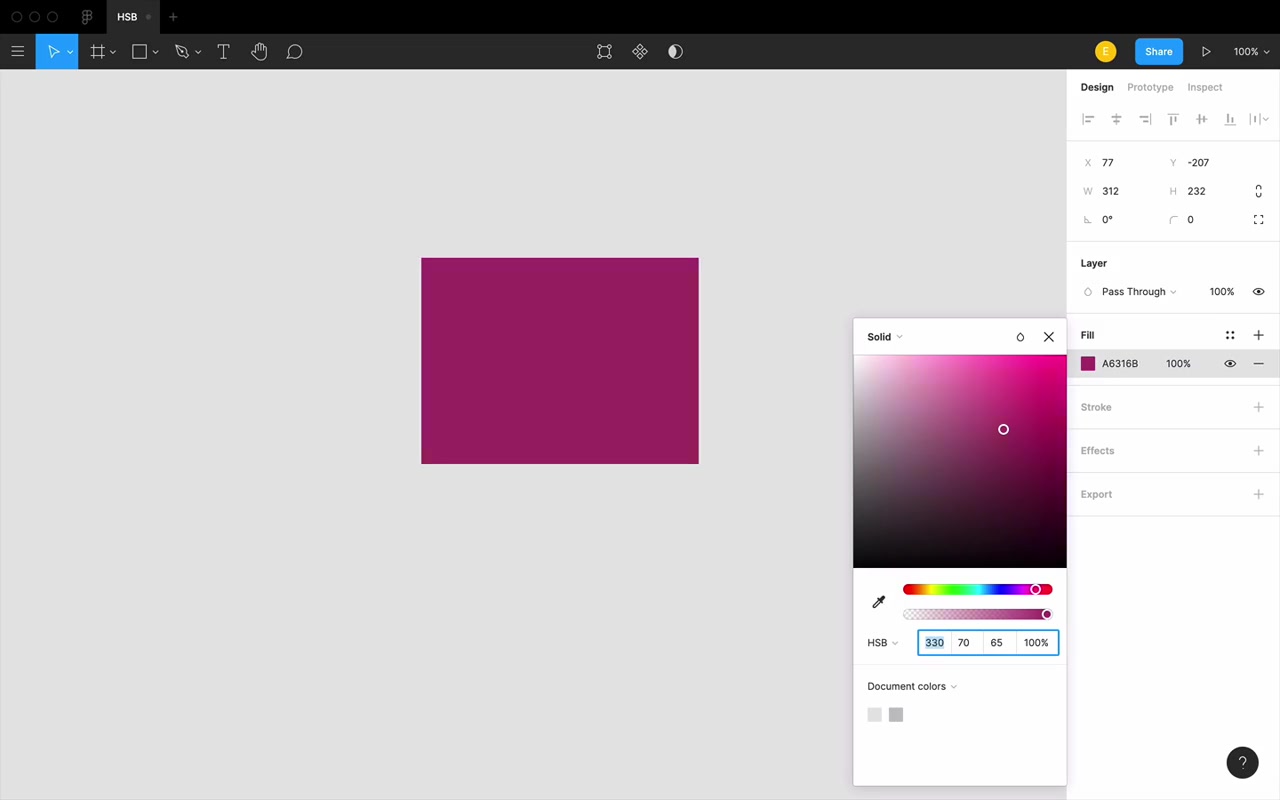
Key insight: Hue is independent of shade. Every version of a color — light, dark, desaturated — shares the same hue value.
Practical use of hue — bending a color:
“This error message, it kinda feels boring. Maybe my app is supposed to be pretty chill and relaxed, and this feels very intense and in your face. I’m just gonna try bending the hue a little bit.”
- Shift hue +10–20° toward orange → still reads as red error, but slightly warmer and less aggressive
- Shift hue down toward 340° → starts approaching pink; “I can kinda have a red that has a hint of pink in it”
Hue is really good for coming up with those slightly different variations — making something more interesting, making it match your brand just a little bit more.
Saturation
Saturation runs from 0% to 100%:
- 0% = always gray (and “gray” in this course always includes white and black)
- 100% = maximum richness — the most color injected into that gray
“I’m gonna kind of inject color into the gray. That’s a good way to think about it.”
Going from 100% down: you’re removing color until all you have is gray. Going back up: you’re injecting color back in.
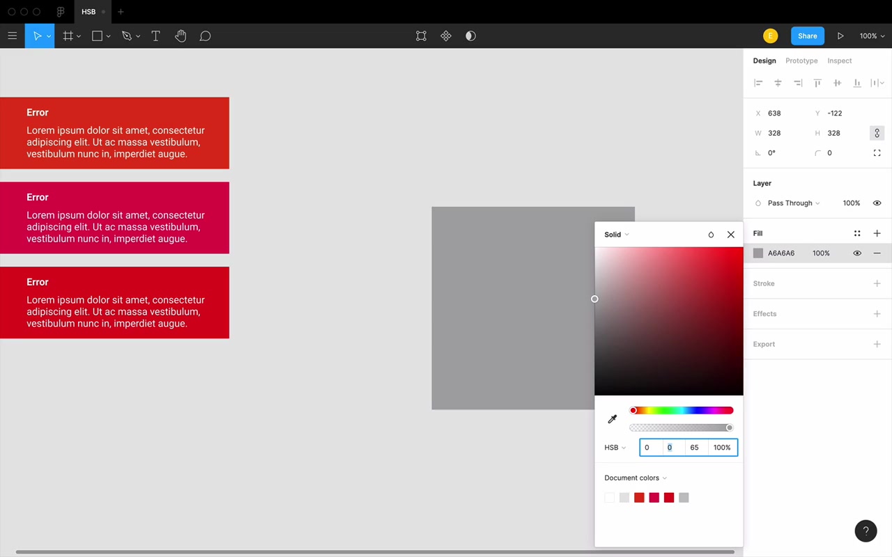
Vocabulary to build: A fully saturated color is rich. A low-saturation color is dull or flat.
“Another word that you will hear me use a ton in describing saturation is richness.”
Practical use of saturation — toning something down:
When a color feels like too much, searing itself into your eyes, reach for saturation:
“You know what? This red with 70% saturation actually feels a lot better compared to this blazing red right here.”
The key is to blink, step back, and reassess — don’t just watch the number slide, because it’ll just look like it’s fading. Give your eye a moment to re-evaluate.
Brightness
Brightness also runs from 0% to 100%:
- 0% = black
- 100% = not white — this is the key surprise
The light bulb analogy:
“Think of brightness like having a light bulb in a dark room. When that light bulb is off, 0% on, that room is pitch black. As I start to turn that light bulb on a little bit more, it’s going to light up the room, but only so much… no matter how much I turn on that light bulb, I can get a brighter and brighter blue, but I’m never gonna get white. There’s no blue that’s so strong that it just turns into white. That’s not how color works.”
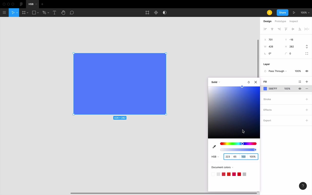
Figma color picker mapping:
- Saturation = left ↔ right on the color square
- Brightness = up ↔ down on the color square
graph TD
    A["White<br/>(top-left corner)<br/>S=0, B=100"]
    B["Pure Color<br/>(top-right corner)<br/>S=100, B=100"]
    C["Black<br/>(entire bottom row)<br/>S=any, B=0"]
    A --- B
    A --- C
    B --- C
Black and White Are Not Opposites in HSB
“Black and white are not opposites in this color system.”
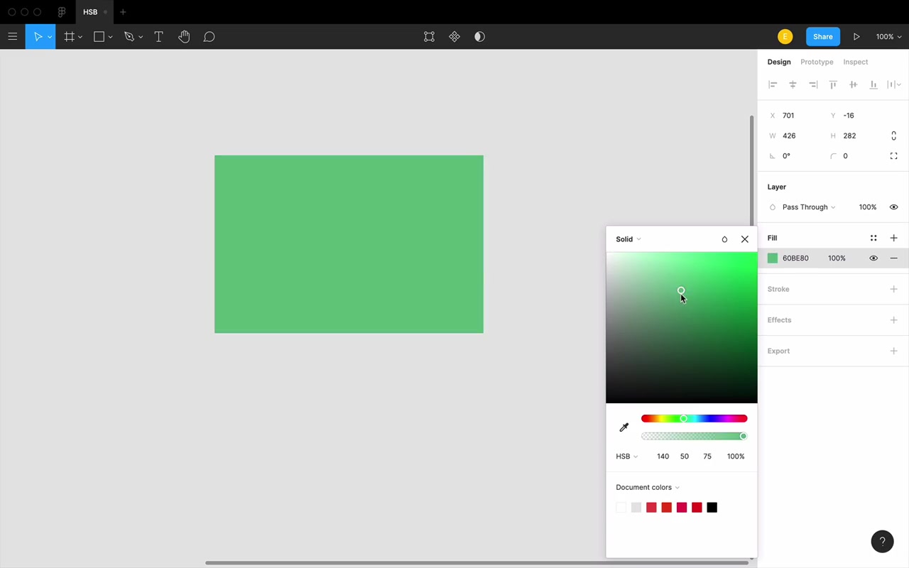
On the Figma color picker:
- White = a single point: top-left corner (S=0, B=100)
- Black = the entire bottom row — any saturation value at B=0 is black
Getting to white requires two conditions: saturation=0 AND brightness=100. Getting to black requires only one: brightness=0 (saturation is irrelevant).
Adding White vs. Adding Black
When you mix white into a color (using a 50% opacity white layer over a background), what happens in HSB?
- Saturation decreases
- Brightness increases
Movement in the color picker: toward the upper-left.
When you mix black into a color (50% opacity black layer):
- Saturation stays the same (or nearly)
- Brightness drops (roughly halved)
Movement in the color picker: straight down.
graph LR
    Base["Base Color<br/>e.g. S=65, B=46"]
    White["Add White<br/>↑ Brightness<br/>↓ Saturation<br/>(move up-left)"]
    Black["Add Black<br/>↓ Brightness only<br/>(move straight down)"]
    Base --> White
    Base --> Black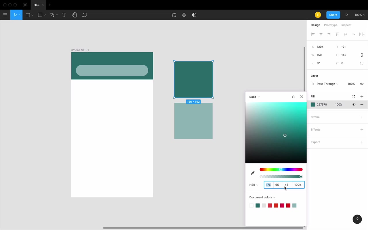
This matters: In real-world shadows and lighting, a darker variation of a color isn’t made by adding black — it’s made by removing white. Those are different operations in HSB.
“We always wanna think in terms of adding white and removing white, not adding white or adding black.”
If you rely on adding black to darken colors, your dark variations will tend to look flat. Instead, make hand-picked variations by moving down and to the right in the color picker — this produces a darker but still-rich result compared to the flat look of black-at-reduced-opacity.
Saturation Works Slower for Dark Colors
This is a subtle but important quirk: the same numeric saturation value looks very different depending on brightness.
Bright card example (B ≈ 96%): At just 6% saturation, the color is clearly recognizable as aquamarine. A tiny injection of color goes a long way.
Dark sidebar example (B ≈ 15%): At 6% saturation — looks completely flat gray. At 13% — still nothing, still gray. Had to get to about 44% saturation before you could clearly perceive the color.
“When you’re working with a very bright color, you actually don’t have to add in very much saturation at all for it to be kind of apparent. But when you’re working with a very dark color, you can add in a shocking amount of saturation and it’s not gonna look crazy.”
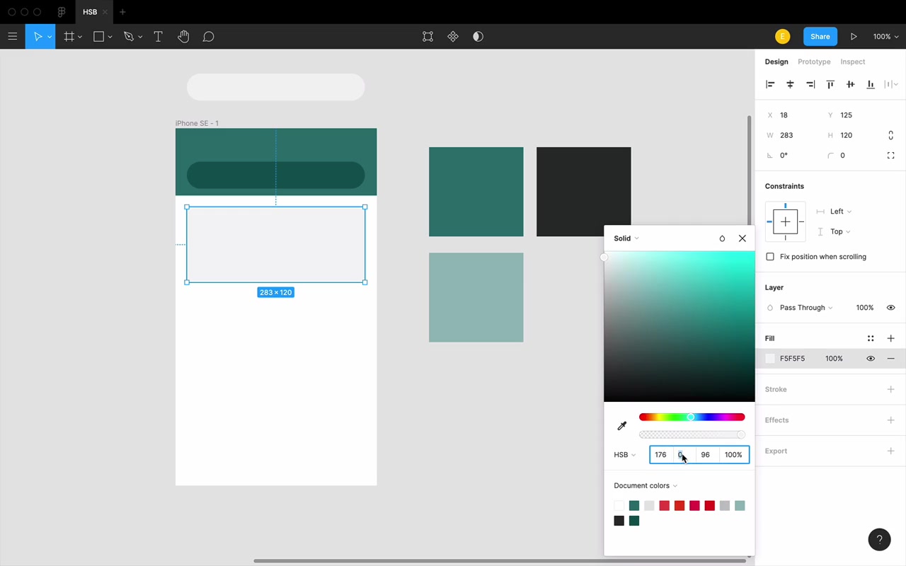
Practical consequence: dark UI elements (like sidebars, navbars) can take much higher saturation values before they feel “too colorful” — and you need those higher values to make the color actually show up.
Homework
The assignment is a color guessing game — forge a mental connection between HSB numbers and the actual colors they produce.
“The goal is that you would be able to look at any color and not only have a sense of roughly what the HSB values are, but eventually you will see a color, know how you wanna change it, know which of those properties you need to change, and by roughly what amount. Now it’s a long road, but you will get there.”
HSB is foundational — everything in the color section of this course builds on it.