Responsive UI Design
A complete framework for responsive design — breakpoints, the 3 core tenets, and pattern libraries for navigation, tables, grids, text, images, and forms.
[1:25] What changes across devices?
“Really the point of design is to create beautiful, usable websites that go into the real world and millions of people benefit from them. And one of the key skills in bridging the gap between pretty pictures in Figma and great websites in the real world is responsive design.”
Responsive design is best thought of as device-agnostic design — whether a website is requested from a tiny phone, a medium tablet, a laptop, or an extra-large monitor, it looks and works as good as possible for that device. It responds to the device that requests it.
Screen width
90% of responsive design thinking is about changes in screen width. It causes the most issues, requires the most thought, and the most work.
Screen height (largely irrelevant)
Screen height is largely irrelevant because we’re already used to sites having vertical scrolling. Whatever the height of the content, users just know they scroll down until they reach the bottom.
Width is different — if content runs off the side and requires horizontal scrolling, that’s considered a much bigger inconvenience.
“I’ll almost never adjust the height simply because it doesn’t make that much of a difference.”
Exception: if there’s a bunch of fixed UI at the top or bottom, you’d want to check that a very short phone can still see everything.
Hover states
On devices with a mouse cursor, hover states work well. On phones, some browsers will recognize hover states and trigger them on tap. However, one type of hover interaction won’t work on mobile at all:
“That’s anything where you have to hover on a parent element and then keep hovering on it in order to access something like a child element.”
Gmail famously does this — it’s a great interaction on desktop but absolutely impossible on a mobile device. Avoid it in responsive design.
Target sizes
A mouse cursor comes to a one-pixel point, making it easy to click precisely. A finger obscures what it’s tapping — you can’t even see the contact point.
“It’s for this reason that you’ve heard me say in the course and I will say it again, that on mobile, tap targets should typically be much bigger.”
Guidelines:
- iPhone: 44 × 44 pixels minimum
- Android: 48 × 48 pixels minimum
You don’t need to hit this 100% of the time (text links can be difficult), but the tappable area should be 44 × 44 as often as possible on mobile.
[5:20] Creating a responsive plan
“All these details of the responsive design work you’re doing need to be captured in a responsive plan — and maybe this is an overly constrained way of saying it. I’m not saying you need to have something on paper, although you almost certainly would. At the minimum you need to sit down with your developer and open up Figma and go over exactly what’s gonna happen in a number of situations.”
A responsive plan covers three things:
Where does space get added/subtracted?
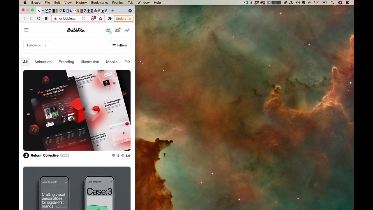
When a screen is 510px wide and your design is 500px, where does that extra 10px go? In Dribbble’s case — not into the margins, but into the content (the shots get wider). Every detail of where space is added or taken from needs to be defined.
Where do major layout changes (breakpoints) occur?
A breakpoint is the industry term for a major layout change. As the screen grows, small changes are local (space added to margins or content). At some point — boop — things snap. That’s a breakpoint.
Example: Dribbble snaps from one column of shots to two columns at roughly 620px wide. The header also has multiple breakpoints as it transitions from mobile (hamburger menu) to various desktop versions with progressively more spacing.
What documentation should cover:
- When there’s a small change: where does space get added to or taken from?
- When there’s a big change: what does the layout look like just before and just after?
Technique to check breakpoints in Figma: At each breakpoint, document the widest version of one layout plus the narrowest version of the next — make sure the design looks native at every size, not just at the snap point.
“The goal is just to make sure that every possible size the design looks just like it was completely designed 100% for that size.”
Full range of sizes to consider:
- Minimum: ~300px (smallest iPhone is 320px)
- Maximum: ~2000–3000px (layouts don’t typically change beyond ~1440px)
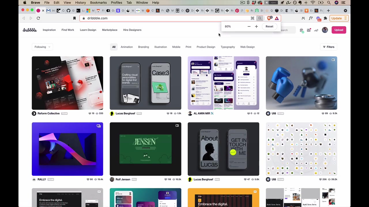
Dev tools trick for testing: Open Chrome dev tools, dock them to the right, and the page can now shrink below 500px. Use the device emulator button for standard phone sizes. Use Command + Minus to zoom out and simulate very large screens.
What states apply only to certain screen sizes?
Some UI elements — like a hamburger menu — exist only on mobile and have no analog at desktop sizes. Mobile often has states like search, menu, popover that just don’t appear at other sizes.
“You just wanna make sure you’re capturing all those.”
[12:08] The 3 tenets of good responsive design
The content determines the breakpoints
“Things shouldn’t really change layout until the content determines that they need to.”
In Dribbble’s header, the layout doesn’t snap until the search bar gets awkwardly close to “Hire Designers” — that’s content determining the breakpoint. The wrong approach is defining breakpoints at common device widths like 568, 375, 1024 — if you set a breakpoint at 1024 because iPad is 1024px, at 1023px things look funky.
“So this is something I’ve been guilty of in the past… you’ll see a lot of sites where they might have a break point at very common device sizes like 568, 375, 1024. And a lot of those, like 1024 is a very common iPad screen size. And so if you see a break point for that, like oftentimes they’re just trying to make sure that at that width everything looks really good, but you might go to 1023 and find that things look much funkier. And that is not the right idea.”
Translate conceptually, not literally
Don’t scale or shrink the desktop design down — translate the concept of what it’s communicating.
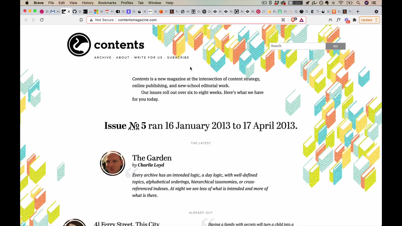
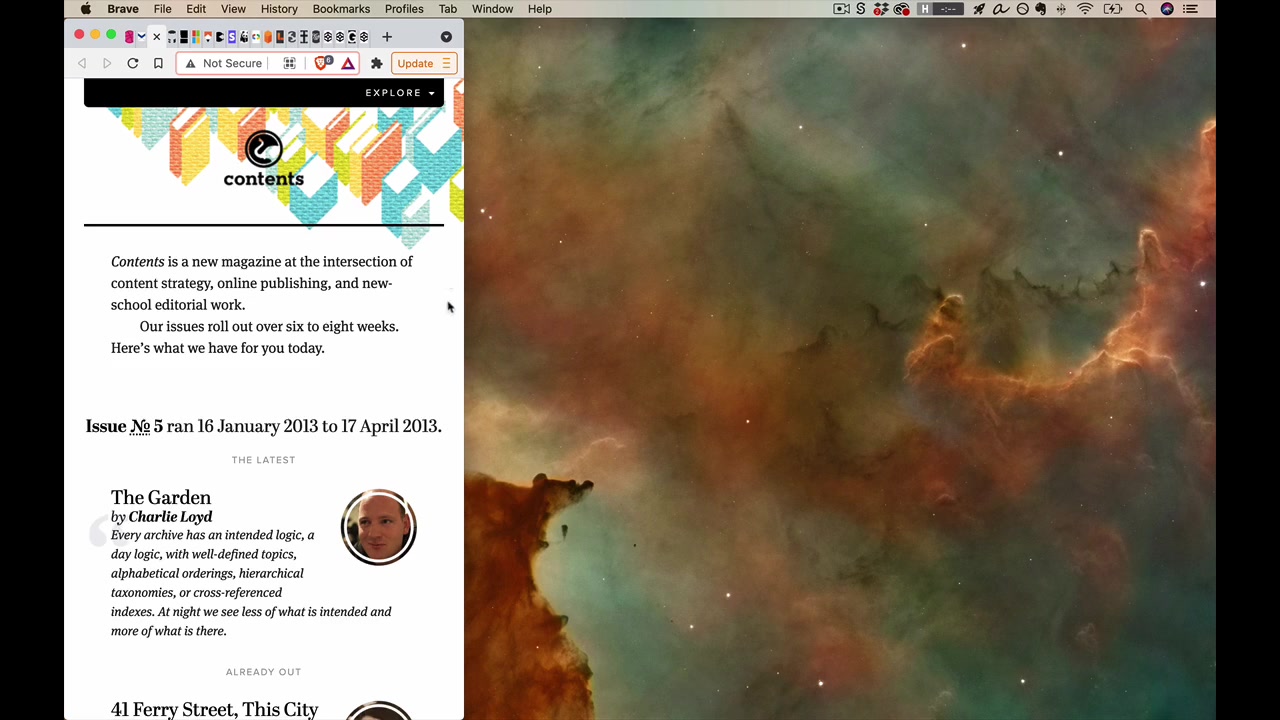
Example: Contents Magazine has colorful scattered books in their header. At the widest width they’re scattered in a natural way. As the screen shrinks, a smaller smattering. On mobile, just a few peeking from the top. They didn’t take the same layout and scale it down — they asked what this concept looks like at each width.
“They’ve taken the concept and they’ve translated that. They haven’t literally taken say the same design and scaled it.”
The header is similarly conceptual: on mobile, what does a header need to convey? The logo yes. Navigation gets hidden behind a button click — not because they crammed everything in, but because they translated the idea of a header to that context.
Mobile first (or, generally: hardest first)
Mobile first = design for small screens before large screens.
“Because it forces absolute clarity on what’s important. When you have a smaller screen size to work with, you’re forced to say, look, the content is what’s really important here.”
If you design large first and are undisciplined about what you put on screen, making a small version is much more work for both designer and developer — you weren’t clear about what was important.
Mobile first also helps with client work:
“If you have a client and your first conversations are like, what are the absolute most critical things to show on the smallest version of this website? They don’t get to say everything’s important.”
However, mobile first isn’t the end of the story. The instructor reframes it as hardest first:
flowchart LR
    A["What's the hardest part?"] --> B{"Interaction<br/>complexity"}
    A --> C{"Visual<br/>complexity"}
    B -->|"Hard to design<br/>interactions on small screens"| D["Mobile first"]
C -->|"Hard to nail visuals<br/>on small canvas"| E["Desktop first"]- Mobile first works great when you have a lot of content, elements, and interactions (complicated page)
- For a landing page or marketing page where visuals are the hard part, design desktop first — it’s harder to get the stunning effect right on a large canvas, but then you can scale it down
“So maybe a good way to think about this is design whatever is hardest first.”
General Patterns
[20:08] Rows-to-columns
The most fundamental layout pattern. On desktop, items are displayed in a row. When the screen narrows:
“Take what starts as rows on large screens and make them columns on smaller screens.”
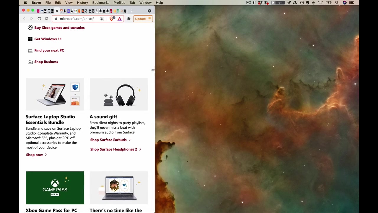
Microsoft.com exemplifies this. A row of cards becomes a column. Even the footer’s “row of columns” becomes a “column of columns.” This works for things that are obviously rows, but also for hero sections — “text + image” as a row snaps to “image stacked over text” as a column.
[22:14] Hide
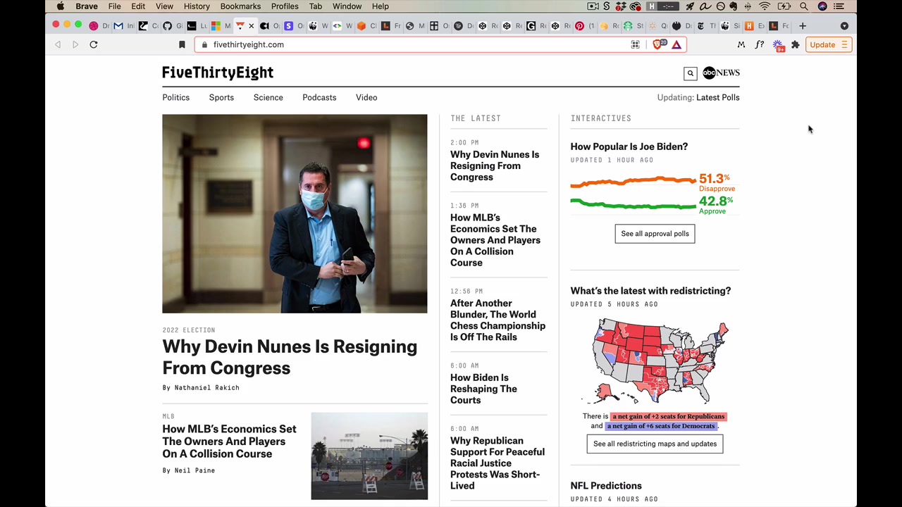
Don’t show everything by default on mobile — hide it behind a click (not completely inaccessible, just one click away). FiveThirtyEight collapses its entire nav behind a “Menu” button. The content is still there, just secondary to the main page content.
“The whole idea of the hide pattern is you don’t need to show everything by default, you can hide it behind a click or in this case, a tap.”
[23:01] Drop
Move secondary content lower on the page rather than removing it. In FiveThirtyEight, the sidebar columns drop to the bottom when the screen is too narrow for three columns.
Note on FiveThirtyEight’s intermediate widths: even a nice site can look awkward at the “no man’s land” between wide mobile and portrait tablet — too small for side-by-side columns, too wide for a pure mobile layout.
“This is something where as nice as this site is, if they had a more solid responsive plan, this would look like perfectly native and perfectly well-designed even as sort of these awkward screen widths.”
[24:25] Remove

Content disappears entirely — not hidden behind a click, not dropped to the bottom, just gone. Opal C1 removes the product name, colors, and price from their sticky header on mobile (not totally inaccessible — you see them during the checkout flow). Stripe removes the device images entirely at narrower widths.
“There could be [a mobile version of them] but in this case they said, you know what? They’re not really adding anything until we’re kind of at this awkward width.”
Note: “hide” and “remove” are also two of the six strategies of simplicity — see the Simplicity lesson for more examples.
Navigation Patterns
Working through the Rebalancr app (a fictional portfolio rebalancing tracker):
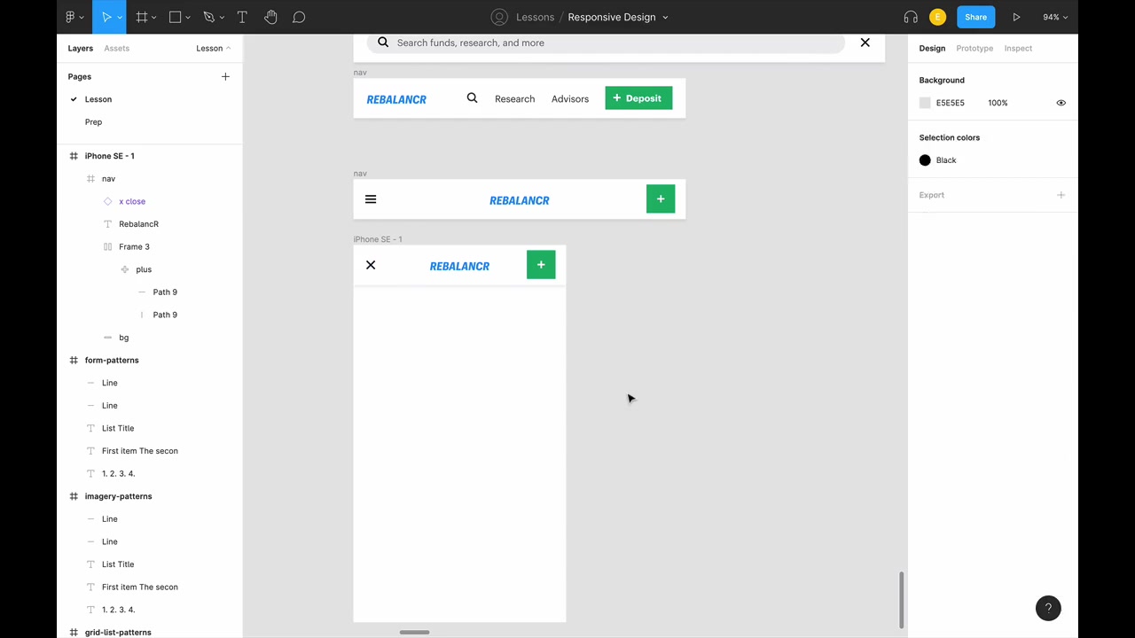
Key Figma techniques:
- Wrap nav items in a frame (Option + Command + G) — not a group. Groups have wonky resize behavior; frames allow intelligent resizing
- Set constraint behavior: logo centered, left items fixed-left, right items fixed-right, background fixed to all edges
Nav breakpoints for Rebalancr:
- 1152px — full nav, everything visible
- 1000px — search bar collapses to icon (hidden behind click), separate expanded search state needed
- 999px down to ~800px — same layout but search opens as full-width takeover of the nav bar
- Below 500px — hamburger menu (on the left, as is most typical), logo centered, Deposit button becomes icon-only
For the hamburger menu icon itself, use 16px padding all around to get close to 44 × 44 tap target.
Mobile menu design:
- Hamburger button becomes an X when open
- Nav items from the top bar plus sidebar items all go into the menu
- Include search at the top
- Each text item should have line height + spacing ≥ 44px (tap target)
- Bigger text looks natural and well-spaced — don’t just shrink the desktop nav text
“The goal with responsive design as always is that at every single width things look as native and intuitive as possible.”
[37:54] Menu hidden behind buttons
The standard hamburger menu pattern. The full nav is hidden behind a button tap — the most common approach, seen everywhere from Stripe (hamburger on the right) to Rebalancr (hamburger on the left). When opened, the button typically transforms into an X.
[38:20] Off-canvas effect
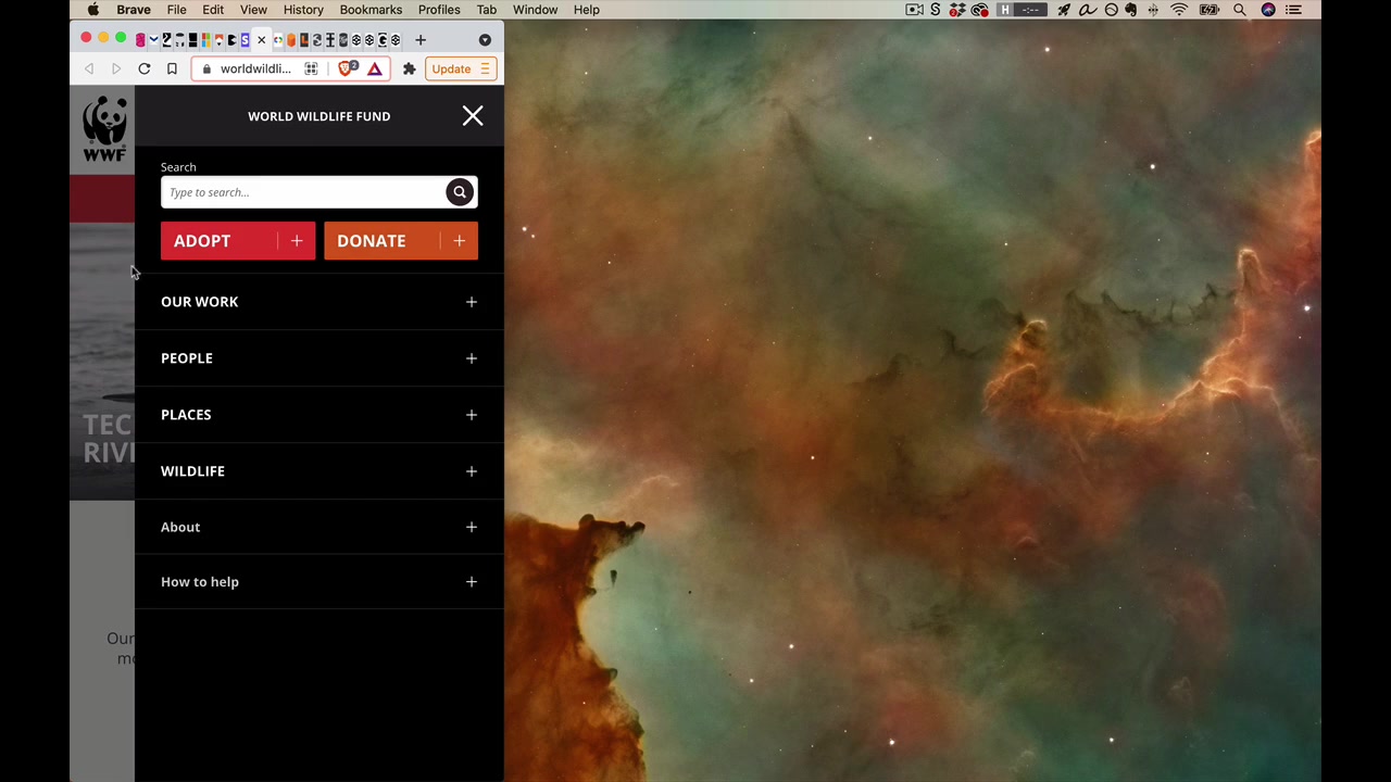
Menu slides in from the side rather than appearing from nowhere. WWF’s website does this — gives spatial physicality, the background darkens, and the user sees the transition instead of a jarring snap.
“Where possible, it’s great to add these animations so that it doesn’t just sort of snap from one version of the screen to the next, which can be kinda confusing. But instead the user can see what’s happening in between the different states.”
[39:01] Prioritized items
Show only the most important nav items; the rest go into a “More” dropdown as the screen shrinks. As the screen gets narrower, more items move into “More” until eventually everything collapses to a hamburger at the smallest sizes. Amazon Web Services does a scroll-variant where items that don’t fit can be scrolled via arrow buttons, with a fade indicating there’s more.
“It’s not like you need to use just one of these — instead you can kind of mix and match across various screen widths.”
[40:35] Footer anchor
The “nav” link jumps down to the bottom of the page (via an HTML anchor) where the same nav items appear in the footer. Contents Magazine does this — when you’re on mobile and tap “Explore,” you’re not taken to a new page, you’re scrolled to the footer navigation.
This works well because after reading through a page, a reader who wants to know “what’s next?” naturally finds the nav right there at the bottom.
Stacked nav
At some breakpoint, turn horizontal navigation vertical. Instead of a hamburger, the nav snaps from one row to two columns. The instructor does this on his own site — it looks natural at both the wide and narrow ends of that breakpoint, with no width where it seems out of place.
[43:05] Container Patterns
flowchart TD
    A["Container patterns"] --> B["Infinite-width<br/>(expands without bound)"]
    A --> C["Max-width<br/>(content stays centered<br/>in fixed-width box)"]
    A --> D["Snap-width<br/>(max-width snaps to<br/>smaller value at breakpoints)"]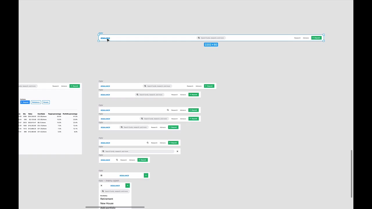
These patterns can be mixed and matched. The same page can have an infinite-width hero image, a max-width content container, and a snap-width grid — whatever keeps the layout looking natural at every size.
Infinite-Width Container
The element stretches 100% of screen width, forever. Used for full-bleed backgrounds, hero images, and headers with background colors. The challenge in responsive design is keeping images looking good as the container grows wider.
Max-Width Container
Content is centered within a fixed maximum width. At screens wider than that max, the margins just grow. Prevents content from becoming uncomfortably wide on ultra-wide screens.
Fitt’s Law note: items locked to screen edges (like the Deposit button in Rebalancr’s infinite-width nav) are actually easy to hit even when far away — you just slam the cursor into the corner.
Snap-Width Container
The max-width itself snaps to a smaller value at breakpoints — like Bootstrap’s grid containers. Right now the grid is one width; as the screen shrinks past a threshold, it snaps to a smaller fixed width, then snaps again. Only a small set of widths to verify rather than every pixel.
Sidebar patterns
[49:36] Drop the sidebar
Move the sidebar below the main content when the screen is too narrow. In FiveThirtyEight, both “The Latest” and “Interactives” columns drop to the bottom when the screen narrows — they just aren’t shown to the right anymore.
Regent College’s website keeps its sidebar in place until ~800px, then it all drops below the main content. This works out nicely:
“If someone has read through all of this page and they’re kinda wondering, what’s next? Where can I go to next? Seeing this navigation right here makes a lot of sense.”
[50:36] Hide in top nav
Sidebar items join the top navigation’s hamburger menu on mobile — what Rebalancr does. At 500px and below, the hamburger is visible; tapping it opens a menu that contains both the standard nav items and the sidebar items (like portfolio selections). The sidebar doesn’t appear separately at all at those small sizes.
At 500px and above (where the hamburger disappears), the sidebar reappears as an actual sidebar since there’s enough room for it.
Text patterns
[57:20] Font sizes are (ultimately) about angular sizes
Font sizes are ultimately about angular size — the angle from your eye to the top vs. bottom of the text should always be roughly the same, regardless of device or viewing distance.
“That means no matter what device you’re looking at and how far away it is, the farther away the device is, the bigger the letters are gonna get.”
This is why a TV across the room needs huge text, and a book held in hand needs much smaller text — but both feel comfortable to read. The principle: text on any screen should take up approximately the same angle of your field of vision.
Practical implication: follow the sizing cheat sheet from the Sizing lesson. For H1:
- Desktop: 35–50px
- Mobile: 28–40px
Also account for realistic content — if “Retirement Portfolio” is a very common value, does it fit on one line at 32px? User-inputted text length should inform your chosen size.
[59:06] Ideal text line length is 50-75 characters
The ideal line length is 50–75 characters — not pixels. Use the three-alphabets trick to test: paste three repetitions of the alphabet into a text block. If the line breaks somewhere in the third alphabet, you’re in range.
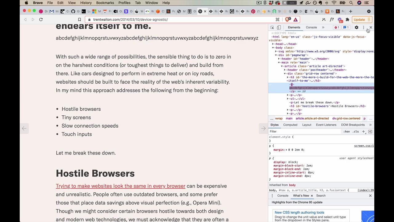
Trent Walton’s site exemplifies this — his font size changes 4 times across screen widths so that the line length stays within this range at every size. If the font stayed small on a wide screen, the narrow column would feel lost in a huge sea of background.
[1:00:48] Remove extra words
You can always remove words, add abbreviations, or do small text tweaks for smaller screens. MDCalc example:
- “Most Popular” → “Popular”
- “My Specialty” → “Specialty”
- “Newest” tab disappears entirely on mobile
“This is like little detail work but it really does help to try and make the experience seem as reasonable as possible even on the smallest screen widths.”
Working mobile first tends to surface these improvements — the abbreviated label often reads better everywhere, not just on mobile.
Responsive footnotes
(Not covered in this video.)
Table patterns
“This is the thing that I most commonly receive questions about in the world of responsive design — how do I do responsive tables?”
[1:02:20] Row-to-mini-table
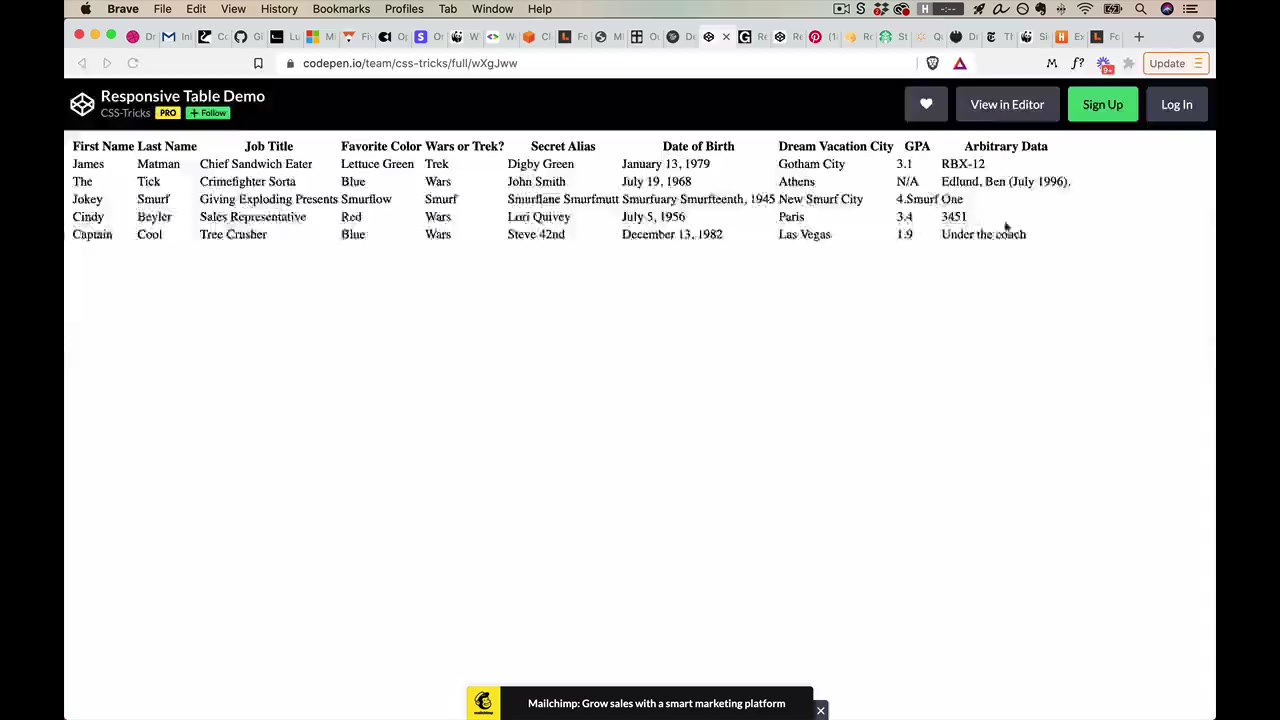
Each row of the wide table becomes its own mini two-column table. Column headers (“First Name”) become row labels (“First Name: James”). Redundant but works well on narrow screens — all data is preserved and readable.
[1:03:36] Remove least important rows
Remove the least important columns entirely. They’re gone — not accessible via scrolling. This is the general “remove” pattern applied to table columns.
Alternative: make the table horizontally scrollable instead of removing columns. Either is valid depending on how important that data is.
[1:04:40] Flip the axis / horizontal scrolling
Works for tables that are much wider than they are tall (many columns, few rows). Column headers move from the top to the left side. Horizontal scrolling is enabled, but the labels remain fixed so you always know what each piece of data refers to.
“It actually makes for a much more decent experience. This is one that you’re gonna want to think about doing especially if you have a very long table — the taller the table is on desktop, the more horizontal scrolling is gonna be involved.”
[1:06:00] Custom reformat as a list
The most custom approach — no one-size-fits-all algorithm. Think of mobile email inboxes: primary info on the left, secondary on the right, primary/secondary text hierarchy within each row.
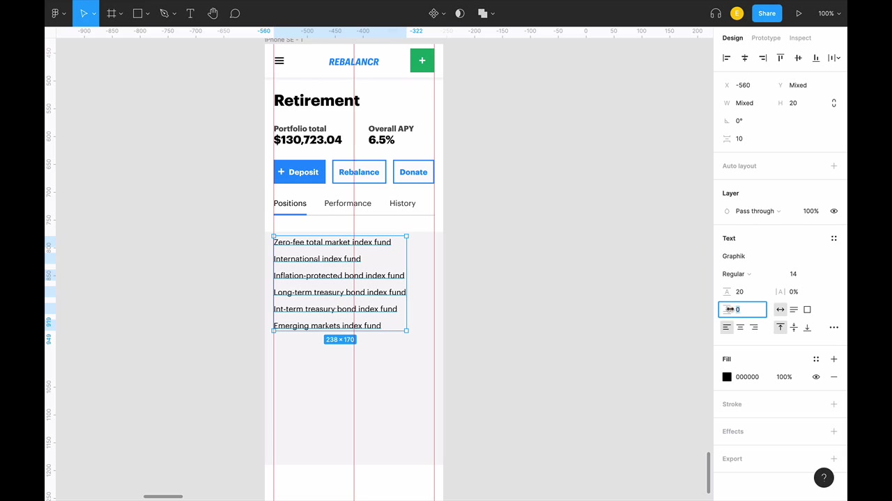
For the Rebalancr portfolio table:
- Primary left: Fund name (big text), ticker symbol below it at 70% opacity (secondary text pattern from Typography unit)
- Primary right: Current portfolio percentage
- Secondary right: Current price (shorter value = less likely to collide with left text)
- Row height: line height + spacing ≥ 44px tap target; with two lines of text, 50px rows work well
- Tapping a row opens a popup/detail view with the remaining data
“And this is why there’s no like one size fits all approach for reformatting a table as a list — ‘cause it comes down to like do users wanna see the current price of whatever index fund this is? Or do they wanna see the quantity that they have in their own portfolio?”
List styling details: slightly darker background color, darker border at top and bottom (~15% opacity black), lighter separator lines between rows (~10% opacity black).
Side benefit of mobile first: designing the mobile list often reveals improvements that carry back to the wider table — e.g., “Percentage” becomes ”%” everywhere, which is just better.
Grids/Lists pattern
[1:18:10] Flexible width, flexible count
Two independent levers for responsive grids:
- Flexible item width — items stretch/shrink as the grid container resizes (Row 7 Seeds)
- Flexible items per row — the count changes as screen shrinks (Pinterest: 5 → 4 → 3 → 2)
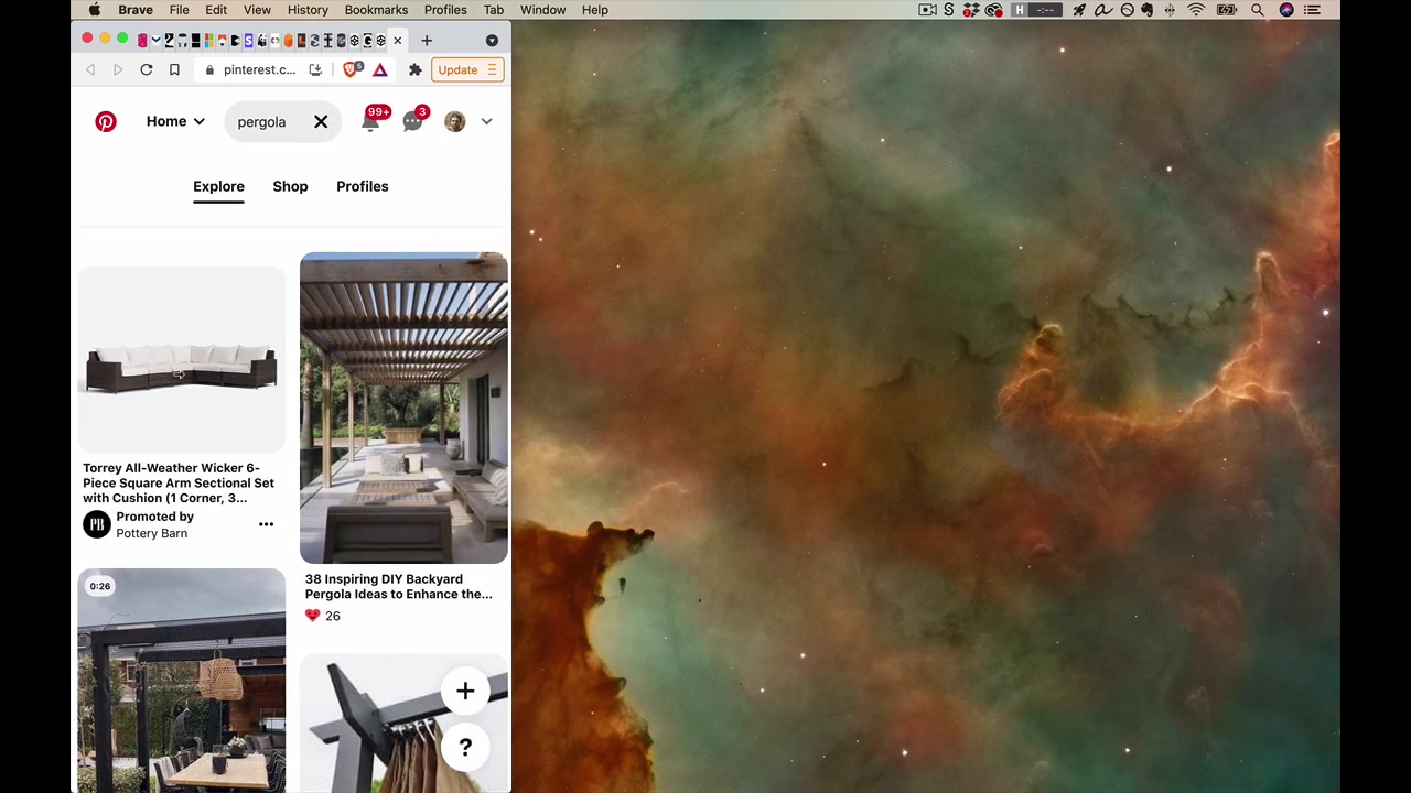
Combining both gives fine-grain control. Wide screens can transition nicely to a single-column list on small screens by adjusting both width and count at each breakpoint.
[1:19:30] Collapsible list items
When rows-to-columns would produce enormous vertical content (like a footer with many sub-lists), collapse list sections to just their title by default. Starbucks footer: each sub-list starts minimized. Users who want those links can expand them individually, keeping the footer short enough to browse quickly.
Photography/Imagery Patterns
[1:20:39] Media object
Image + text laid out horizontally (image on the left, text on the right). On narrow screens, this can stay horizontal with a smaller image rather than stacking full-width — because a full-width image on mobile can be obnoxiously tall.
“A lot of times you may actually want the image to be smaller when you’re on a smaller screen size so that it doesn’t require so much obnoxious scrolling.”
This can feel counterintuitive — image and text side-by-side on small screens but stacked on wide screens. But it makes sense: on large screens a full-width image is fine; on small screens, keeping the image modest lets the content breathe. Flexibility to flip between horizontal and vertical gives many layout options across screen widths.
[1:22:15] “Art direction”
Using slightly different image files at different screen sizes — not scaling one image, but loading images specifically composed for each context.
Contents Magazine: at wide widths, books scattered across the full header; at medium widths, fewer books scattered differently; on mobile, just a small smattering. Each version is composed for its canvas.
Made in Germany design magazine: on mobile, just the issue number. “Dmig, Design Made in Germany” only appears when there’s room.
“They’re sort of using this idea of considering the screen as if that screen size is the only screen size you’re designing for it and saying, what would the solution look like here?”
[1:24:08] Labels above images
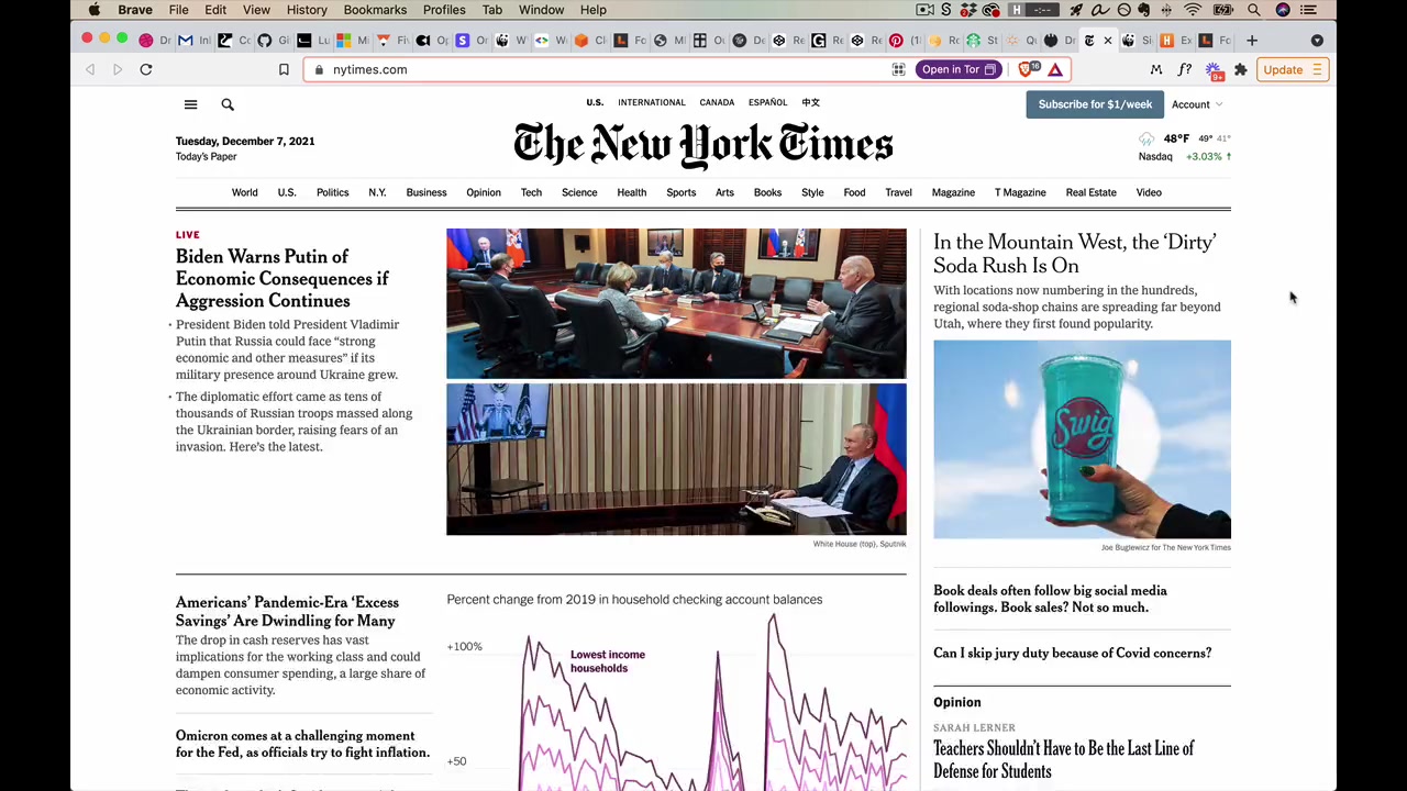
Put contextual text above images on mobile, not below. If a tall image pushes the caption 400px down the page, the reader has to scroll past the image, read the caption, then scroll back up to look at the image again.
The New York Times always shows headline + text before the image on mobile — you always know what you’re looking at without scrolling back up.
Form patterns
[1:25:44] Side labels to top labels
Wide screens can place form labels on the left side of each field (lets the form own horizontal space). At smaller widths, labels naturally go above their fields. Simple, but the pattern to know.
[1:26:18] Multi-column to single column
Same as the rows-to-columns pattern applied to forms. Harvest collapses a 3-column form to a single column on mobile. They also show a banner suggesting the native mobile app — a nice detail.
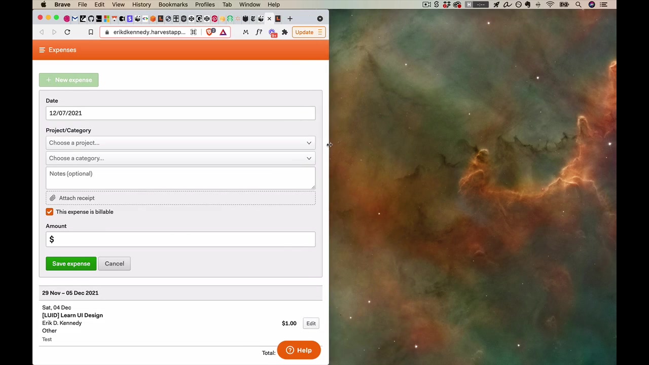
“That’s a very cool little responsive design detail.”
[1:26:56] Sub-element resizing
Buttons: Should be ≥ 44 × 44 tap target on mobile.
Text boxes (important iPhone gotcha): If a text input has font size < 16px on iPhone, it triggers a forced zoom — the viewport zooms in on the field. Jarring, messes with your design.
“And here, if I look right here, I am guilty as charged ‘cause I forgot to do that of course.”
Always set text input font size to 16pt or bigger on mobile designs.
“All right, folks. And that wraps it up for Responsive Design. So I know that was an absolute doozy of a video. I apologize for the length but this truly is an important skill in transferring pretty pictures in Figma into the real world of actually shipping a designed website to millions of people.”