Alignment
Deep dive into alignment as a design tool — centering, pixel center-of-mass, baseline alignment, hanging alignment, and when to intentionally break it.
“Alignment is one of the most important topics in user interface design. And that’s why we are starting with it in this fundamentals unit.”
“Alignment is also — if I had to say — probably the most underrated topic in UI design. There are plenty of things written about color and typography, but very little written about alignment, except through grids, which we’ll cover later as sort of a special case.”
Alignment is critical for making any app appear clean, neat, and simple. Even if your brand is more expressive, you’ll still spend a significant amount of time thinking about how to align elements with each other — “so as to achieve a feeling of maximal cleanness or neatness.”
The lesson works through a sample app (the “Alignment Co.” — a typical data-heavy desktop + mobile table view) starting with elements scattered scattershot, then cleaning them up one by one.
[1:30] Aligning via centering
Starting with the sidebar: use horizontal center (Option+H in Figma) to center the logo box, then apply 8px padding on all sides. Using vertical center (Option+V) to center text within the box gets things close — but the text appears a little high.
“This program is naively centering by the bounding box of the text. And yet, if you look, the text is not really centered inside of its own bounding box.”
CSS on the web will behave the same way, so if you just need to ship it, this is acceptable. But if you want to be careful, nudge manually. The instructor settles on 12px above the text, 11px below.
“As usual, we fail left and fail right until we find kind of the best value.”
For the side nav icons (24×24px), space them at 20px between each — giving each row a total height of 44px. That happens to match the text line height, so icons and text labels stay aligned row over row.
[2:02] Aligning text elements by pixel center-of-mass
When aligning a custom icon (no clean bounding box) next to text, naive vertical centering looks wrong. The fix is a concept the instructor calls center of pixel mass.
“If all of this ink — all these filled-in pixels — had weight, where would the center of mass be?”
For a line of mixed-case text, the center of pixel mass is biased slightly below the midpoint between cap height and baseline, because lowercase letters cluster their ink toward the bottom of the letterform (think: ‘a’, ‘e’, ‘o’ — all mass below the midline, not above it).
For an icon that jets out heavily toward the top (like a location pin), the center of mass is biased slightly upward.
The goal: find where there are equal amounts of ink above and below a horizontal axis, then line those axes up between the icon and the text.
“Those who know physics know that I’m butchering this a little bit.”
Don’t align centered content with left-aligned content by offsetting one to match the other. If the logo is centered and the nav items are left-aligned, leave them be. Schemes of alignment should not rely on the specific widths of other elements — if you translated all the text to another language, you shouldn’t have to change any alignment values.
[8:35] Aligning rounded and pointed elements with flat elements
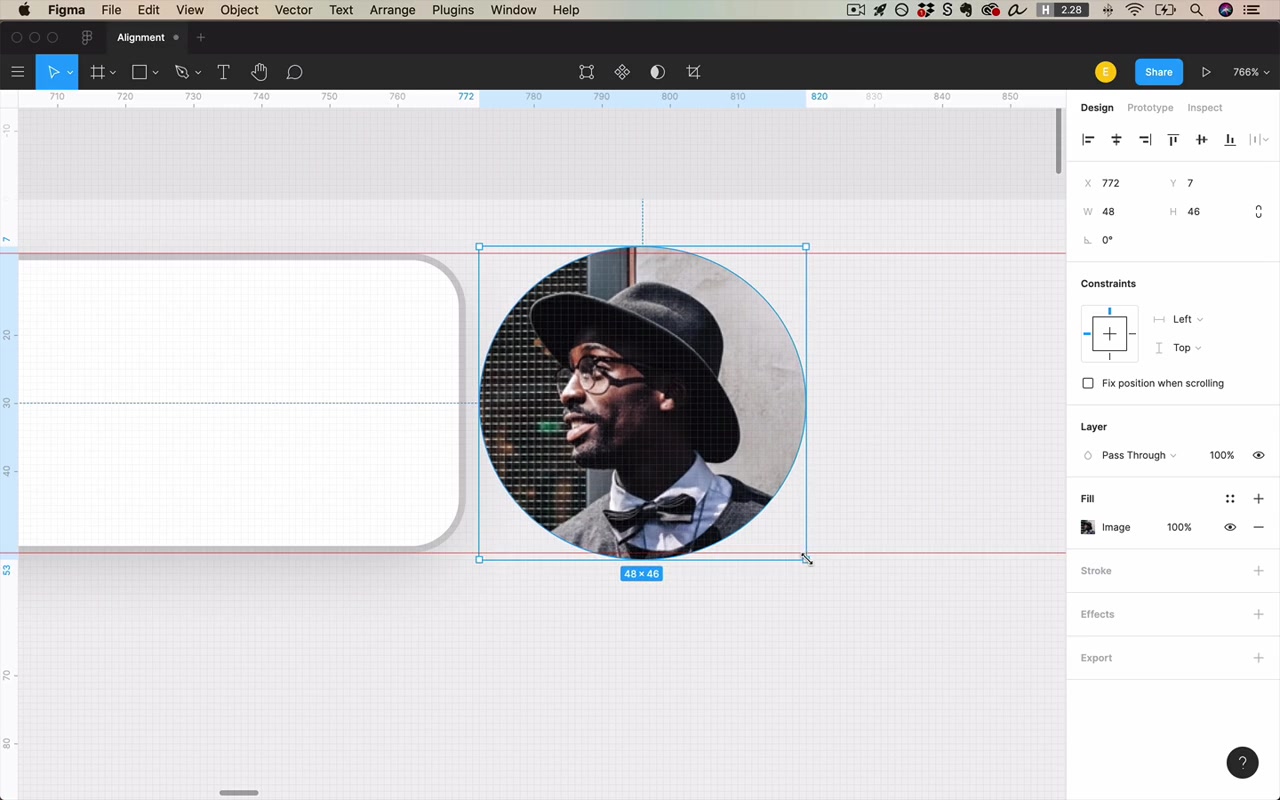
Profile photo (circle) next to search bar (rectangle). The issue:
- A rectangle touches a line of alignment along its entire top edge — every pixel is on the line.
- A circle only touches a line of alignment at one infinitesimally small point at the top.
This creates the illusion that the circle looks “too small” compared to the rectangle, even when their bounding boxes are flush.
“It is an accepted practice in design to make the circle a little bit bigger so that it actually goes past the line of alignment on both sides.”
The instructor doesn’t apply this here because the effect isn’t pronounced, but it’s a valid and widely-used technique.
This same principle is baked into professionally designed fonts: zoom in on any well-crafted typeface and you’ll see that flat letter forms (H, E, T) sit exactly on the baseline, while rounded letter forms go slightly past it (O, C, G all descend a few pixels below the baseline). The extra extension compensates for the optical illusion.
[14:16] Aligning hover states
The profile area (name + avatar at the top of the page) is a clickable pulldown. Nothing indicates it’s interactive. Adding a hover state creates a tricky alignment problem:
- If the hover highlight extends beyond the icon, it breaks the line of alignment with the content below it.
- If the hover highlight stops exactly at the line of alignment, the nav items inside the dropdown need to be indented — and they’ll never align with the main content unless the hover is active.
“There’s not necessarily one solution here. But if I was working on this project, I would certainly think about giving this a little bit more permanent of a display, so that you never even ran into that problem in the first place.”
The practical solution: show the button/chevron always (not just on hover), so the alignment relationship is predictable at all times.
[16:00] Aligning text of different sizes by baseline
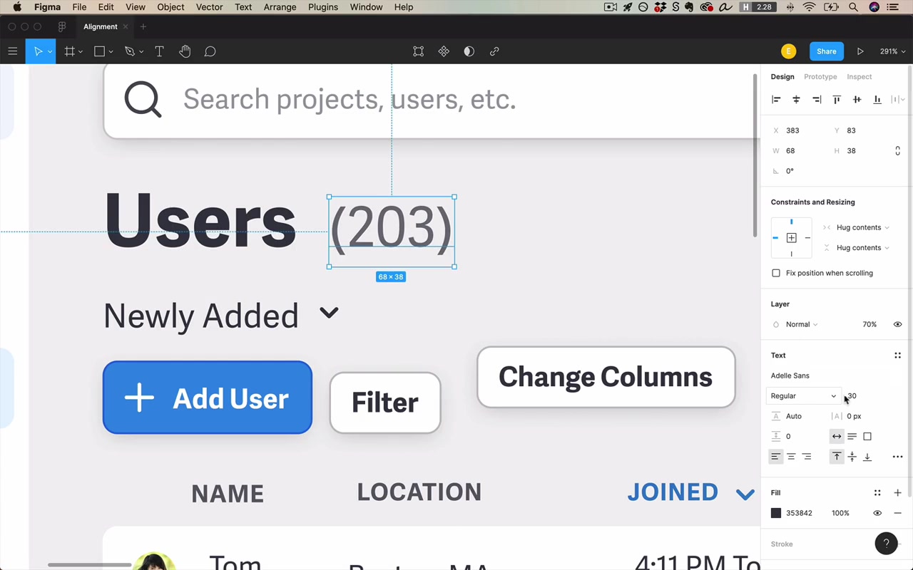
“Users” (large, bold) and “203” (smaller, regular weight, 70% opacity) need to align. Baseline alignment is the correct default.
But there’s an opportunity to buy yourself extra alignment: match the cap height of the smaller text to the x-height of the larger text.
“X-height — it’s the height of the lowercase x. But it’s also the height of a bunch of other lowercase letters. So don’t ask me.”
When you size “203” so that its capital letters reach exactly the height of the lowercase letters in “Users,” the two pieces of text share an additional horizontal alignment line, making the whole unit feel crisper.
“We didn’t need to make this text such that the cap height of 203 is equal to the x-height of the title here. But by doing that, we bought ourselves just a little bit more alignment.”
This is a general principle to internalize: when there are multiple ways to style something, choose the one that buys you more feel of alignment.
[18:13] Aligning buttons
The “Add Users” button was originally oversized — made large to attract attention. But the button already has two other strong attention signals:
- It’s the only button with an icon
- It’s blue; every other button on the page is white
“If I can make up for needing to attract attention using color and an icon, that actually allows me to buy myself a little bit more alignment by shrinking this down to size with the other elements.”
Shrinking the button to match the height of the other row elements makes the whole header row sit on the same baseline, significantly improving alignment — without sacrificing any visual hierarchy.
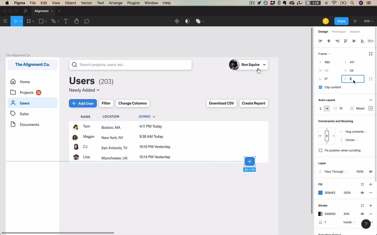
Breaking alignment to attract attention is valid — but reserve it for cases that genuinely call for it. The classic example is the floating action button (FAB):
“By Google’s own admission, you really should break alignment with the rest of the page so that it attracts the most attention.”
A FAB is typically circular, breaks the grid, and is anchored to the bottom of the screen. If it were aligned with the table content, it would look like it belonged to the table.
[20:20] Aligning padded elements
Rule of thumb: align to whatever has the most visual contrast — the element’s outer border or its inner content edge.
When an element has padding (like a table or card), there are two possible alignment lines:
- The outer edge of the element (the border of the table itself)
- The inner content edge (where the data actually starts, inset by padding)
The inner edge is often visually stronger because the outer-to-inner transition can be subtle. But if you give the element a crisp background (hard white) and a drop shadow, the outer border becomes clear enough to align against.
“The best strategy here is to align to the outside if that’s what feels like the strongest line of alignment.”
This applies to tables, cards, and even buttons. The deciding factor is always: which line is more visually prominent?
[20:46] Hanging Alignment — ex. Charity Water
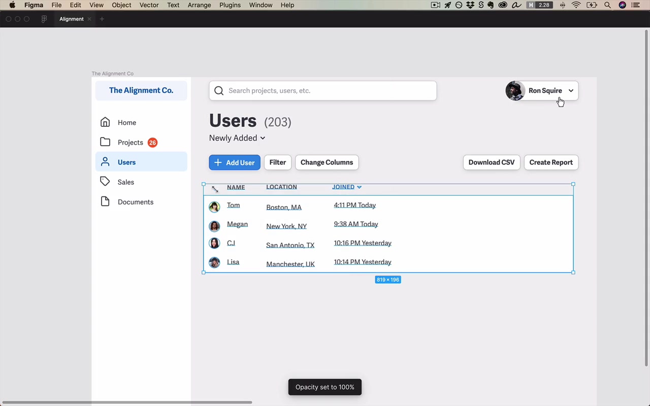
In the table, the column header “Name” sits above the text portion of each row — not above the avatar image — even though avatar + text belong to the same cell. This is intentional.
The reason: the visual alignment between “Name” (header text) and the row names (body text) is much stronger than the alignment between “Name” and the avatar images. Aligning header to text > aligning header to image.
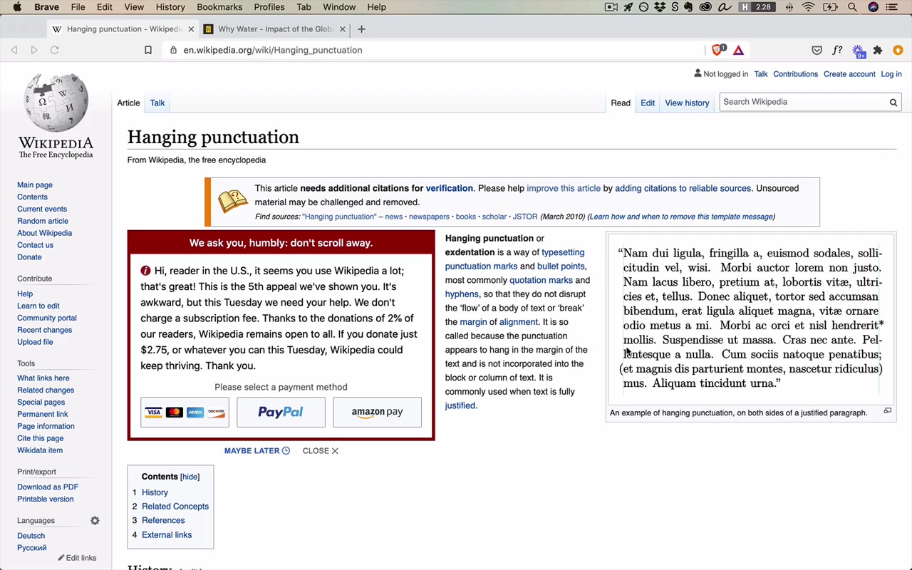
This is an application of hanging alignment — a principle with centuries of typographic precedent:
“Hanging punctuation is the centuries-old typographical tradition of taking punctuation characters like opening quotes and parentheses, and hanging them into the left margin so that your text has as strong a sense of alignment as possible.”
The same logic applies to bullet points and icons. Charity Water does it explicitly on their site: icons hang into the left margin, and the text content begins at the main alignment line.
[26:15] Responsive considerations for the table
The left and right content boundaries are “two of the most important lines of alignment on the project” — not just visually, but because they define how the layout responds to different screen sizes.
The key decision: as the screen grows, what expands?
- Both margins?
- The right margin only (content stays left-anchored)?
- The content itself?
For this desktop layout, the instructor chooses 40px margins on both sides. This is a preview of the full responsive design lesson — for now, pick a scheme that works for this size.
“I don’t recommend making a search bar quite this wide.”
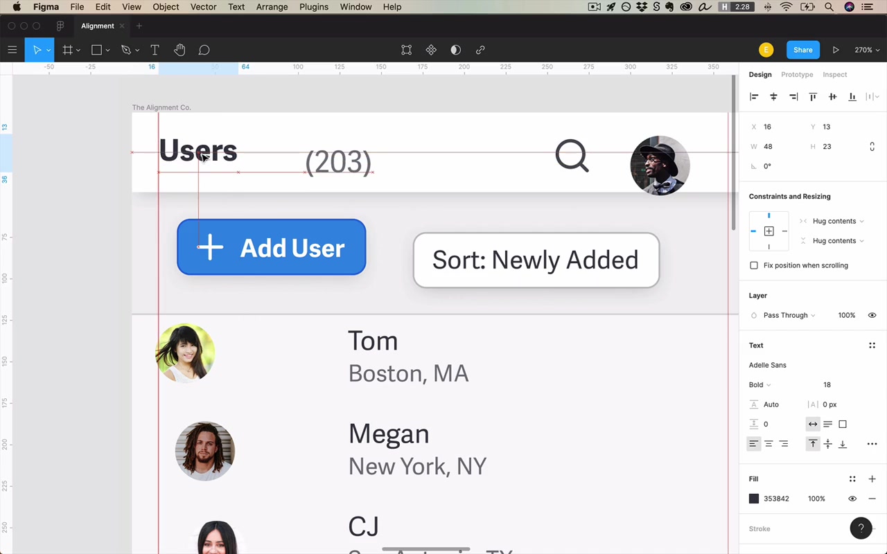
For mobile (Android + iOS), both platforms specify 16px outer margins as the standard. Put guide rulers at 16px from the left and right edges and align everything to them.
[27:02] Vertical centering (especially on mobile)
For the bottom tab bar: divide screen width evenly by number of tabs. 375px ÷ 5 = 75px each. Give each item a 75px-wide container, then center within (Option+H in Figma).
The more important insight is about optical vertical centering:
“A lot of times when you have the choice of centering something in a larger space, what looks the best isn’t necessarily what is perfectly vertically centered.”
When content is mathematically centered in a large vertical space, many people perceive it as sitting “just a little bit too low.”
“I don’t know what weird optical illusion this is.”
The fix: bias slightly upward — a little less space above, a little more below.
“A lot of times if I have to make a choice between being just a pixel high or a pixel low, I will almost always default in the direction of going one pixel up from what might otherwise be perfectly centered.”
This is the same observation that came up at the very start of the video — the text in the sidebar button appeared slightly high after naive centering, and that turned out to be closer to visually correct.
Closing
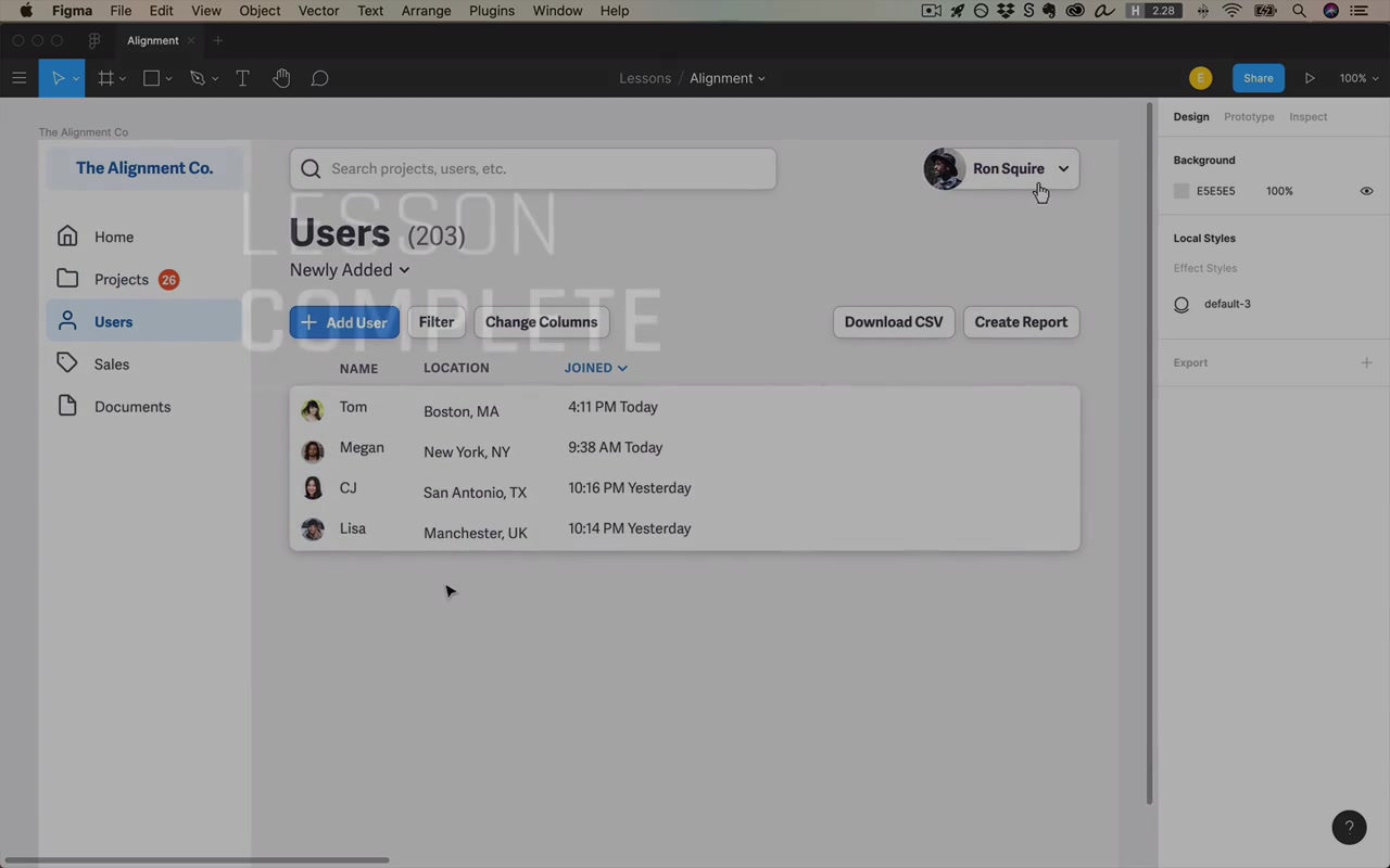
“If I had to drive home the two most important lessons from this video, I would say: first of all, just align everything. Basically every element on your page should be aligned with another element. And this isn’t hard… Nothing was really floating in space. And that’s by and large how it should be in your own designs.”
“Play a little game with it. Sometimes you’ll run into cases where maybe there’s way A and there’s way B — and look at what might buy you just a little bit more feel of alignment. Those little details are the things that can bring a design from good to great.”