Almanac
A design analysis of almanac.io — examining its geometric typography, high-contrast palette, and the 'Big 3' pattern used across five different section layouts.
Patterns extracted
The reusable payload — scan, then dive- P·01 Geometric sans-serif typographybrandpersonality arrow_forward
- P·02 Maximum contrast + single accent colordark-modehierarchy arrow_forward
- P·03 Hero trifecta layoutheroinformation-hierarchy arrow_forward
- P·04 Stat as visual anchor social-proofnumbersattention arrow_forward
- P·05 Scroll-triggered feature carousel scrolllayoutfeatures arrow_forward
- P·06 Z-pattern alternating layout layoutreading-flowrhythm arrow_forward
- P·07 Self-evident feature grid layoutsimplicityefficiency arrow_forward
Geometric Sans-Serif
Letterforms that match the product's personality.
The edge of each character are a straight line, there are no CURVES or nothing, even the shape of the DOT is a square, not rounded, the Y R U they have a vertical line that looks like a rectangle. Just feel squary to me, lot of squared angle — these feels like lego that I can arrange and make something, it reminds me about Tetris.
This is a geometric sans-serif — letterforms constructed from basic geometric shapes rather than mimicking natural handwriting strokes. The square dots, flat terminals, and rectangular cuts are intentional. For a product selling organization and clarity, the font feels like the product: structured, precise, engineered, no decorative flourishes. The weight hierarchy is consistent throughout: one large bold headline, one smaller lighter description — repeated every section. Easy to follow, easy to skim.
Maximum Contrast + Single Accent
One color to rule attention, one accent to direct it.
Overall color are dark background and white text to really help to highlight things — show users what are really important, stands out to remember.
Strong contrast ensures the important content always wins attention. Nothing competes. A lighter blue accent appears selectively (the “1M” figure, the large “M” shape in the background) to draw the eye without overwhelming the palette.
Hero Trifecta
Three questions answered before the first scroll.
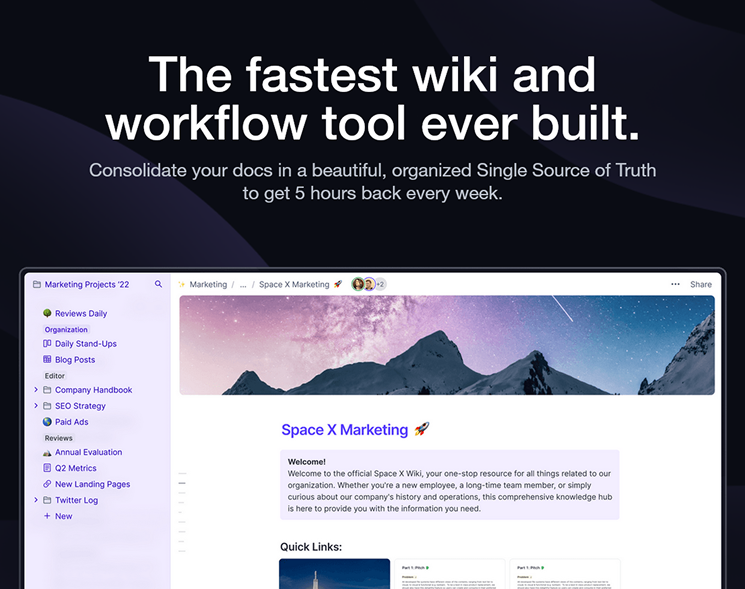
Classic: Header + description + hero. Header is talking about it’s the best product => WHAT. Description is used to elaborate about the reason why it’s best product, what benefits it gave you => answer the WHY. The HERO is added as an illustration, user can see a sneak peek of the product in Action. Every thing are clear there => This is effective and serves the purpose that shows USER knows what the product is all about. Colors background black and the text white really create the absolute contrast => Really attract attention. I really like the texture of the background, some curves of white there make it enchanting and attract attention, without it I think it’s quite neat and boring => Nice touch.
The hero answers three questions in sequence — what it is, why it matters, what it looks like — before the user has to scroll. The subtle curved white shapes in the background are a small but important touch: without them the dark background would feel flat and lifeless.
Stat as Visual Anchor
Show the number before its context — impact lands harder.
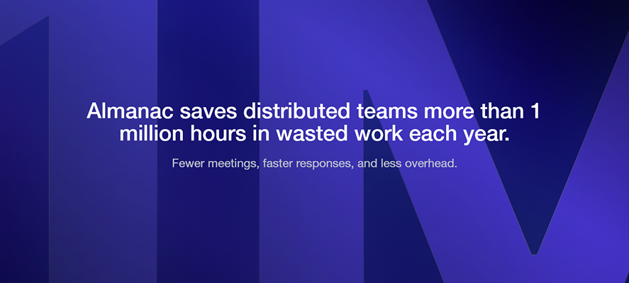
First thing I see is the background, dark blue and the 1M as lighter blue create an immediate effect, really attract attention. I see the 1M before the text, and when I read the text I know what the 1M is about => serves the purpose of highlighting the 1M => very impressive number 1M hours saved. Once again we see the power of 1 big bold header and a smaller lighter description that illustrate the header.
The number is shown as a visual element before its context is given. Your eye catches the 1M, then the headline tells you what it means — so by the time you read “1 million hours,” your brain has already been primed by the scale of that number. The impact lands harder than if it were just embedded in a sentence.
Scroll-Triggered Feature Carousel
Multiple benefits share one section — no clicks needed.
 State 1
  State 2
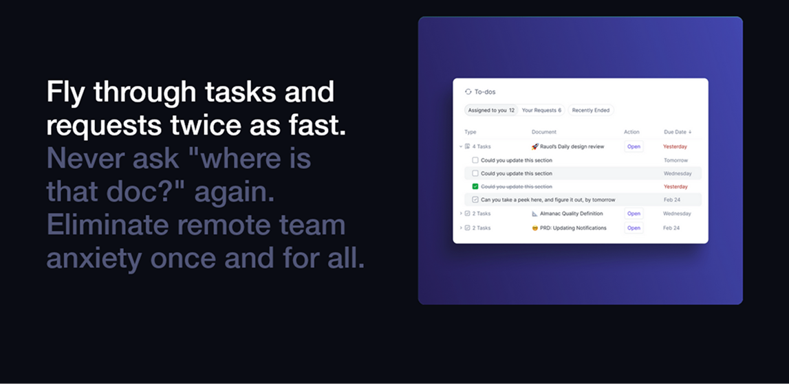
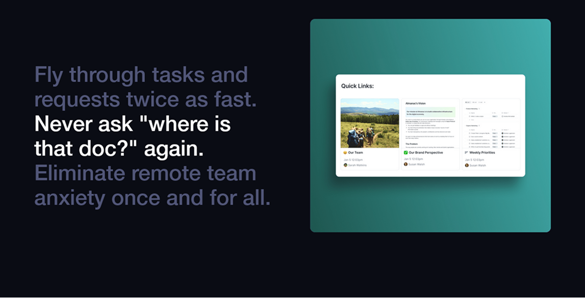
 I like this. Still a combination of header + description + illustration. But design this way I feel like we can save a lot of space, since these are smaller benefits, no need to highlight it big like the first section of the page when we’re talking about the PRODUCT => we dedicate 1 whole page for the combination of header + description + illustration. Things that are related are grouped and present together. With this, users are pretty much in the flow, no need to click anything to see different content/benefit, they just scroll down when they are done with 1 benefit and they immediately see the next benefit.
The scroll-triggered illustration change lets multiple related features share one section without requiring the user to do anything — no tabs, no clicks, just scroll. The gradient color shift (purple → teal) signals that something changed on screen without breaking the layout rhythm.
Z-Pattern Alternating Layout
Reading direction creates natural scroll flow.
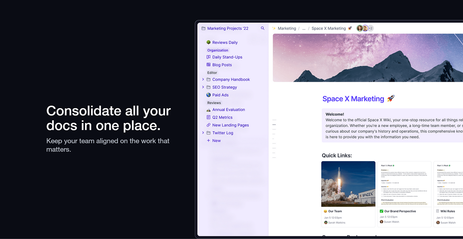 Text left
 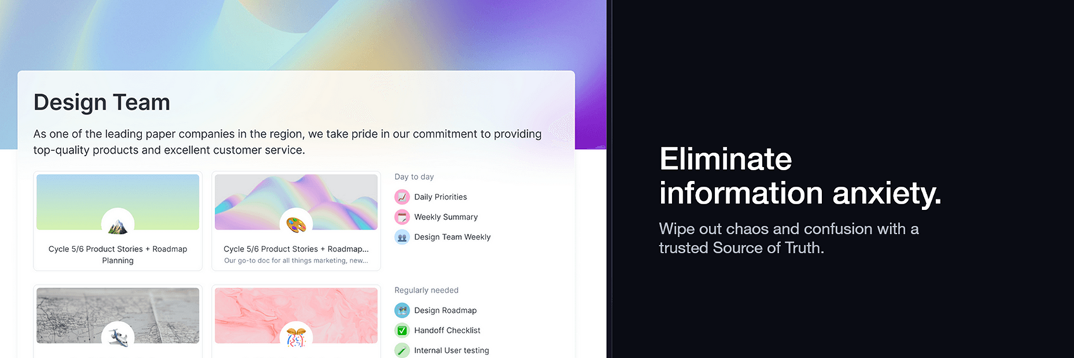 Text right
 Still a combination of big 3. But now text is in 1 side and illustration is in another side and this pattern is repeated and switching side alternatively. Text left image right and then text right image left. This highlights the benefits clearly, and predictable. People often read left to right top to bottom, so first I see text left image right, right below the image of the first section is the text for the next section => I can scroll down and see the text and look left for the images => I feel a sense of smoothness and ease when going through the page.
The alternating layout uses reading direction (left-to-right, top-to-bottom) deliberately — the eye follows a natural Z-path down the page. Predictability creates smoothness: the user knows the rhythm and stops thinking about the layout, focusing entirely on the content.
Self-Evident Feature Grid
Drop the description when the header and visual already say everything.
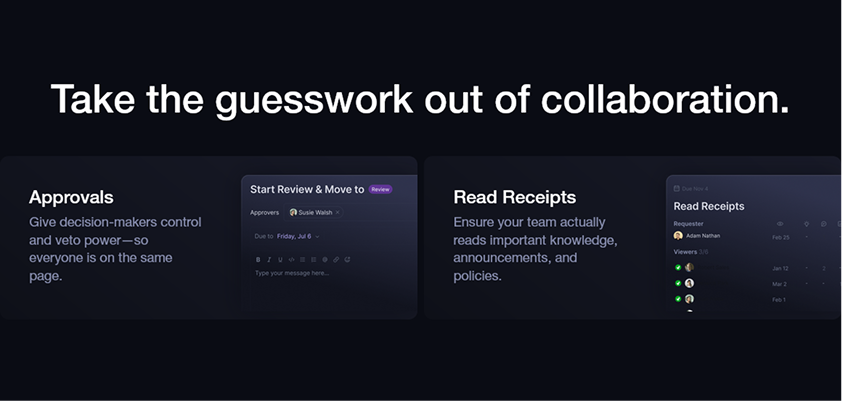 Example 1
 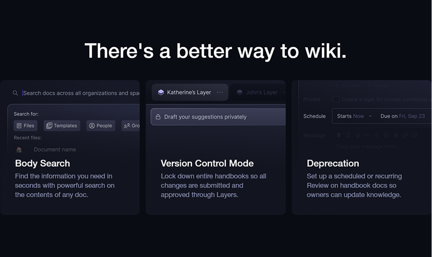 Example 2
 These contain just 2 elements of the big 3: Header + images or texts. If something is clear enough with texts or images => need no description. Save space for users.
When the feature name and visual are self-explanatory, adding a description just adds noise and slows the page down. Dropping it respects the user’s time and keeps the scrolling pace feeling fast and confident.
Overall
Overall, I feel like the typography is nice, neat and clean, easy to the eye and to follow. The combo of big 3 really stands out and there are multiple ways to do it. We can see a lot of space, things are neatly aligned and not cluttered.
Every design decision on this page points in the same direction: structured, trustworthy, no-nonsense. The geometric type, the high contrast palette, the consistent Big 3 rhythm, and the generous white space all say the same thing — this is a product that brings order to chaos. The design is the pitch.