Betterment
How Betterment uses blue and yellow to balance trust and opportunity, and why 3D illustration works especially well for financial products.
Patterns extracted
The reusable payload — scan, then diveTwo-Color Emotional Arc
Blue leads with trust, yellow follows with opportunity.
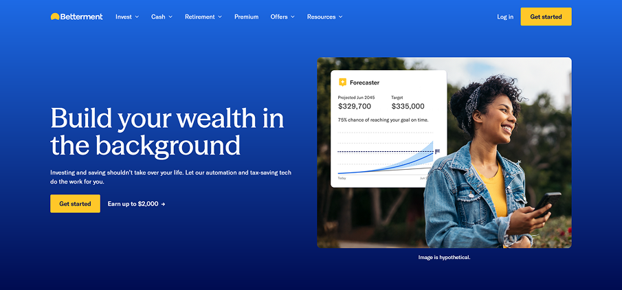 Blue (trust)
 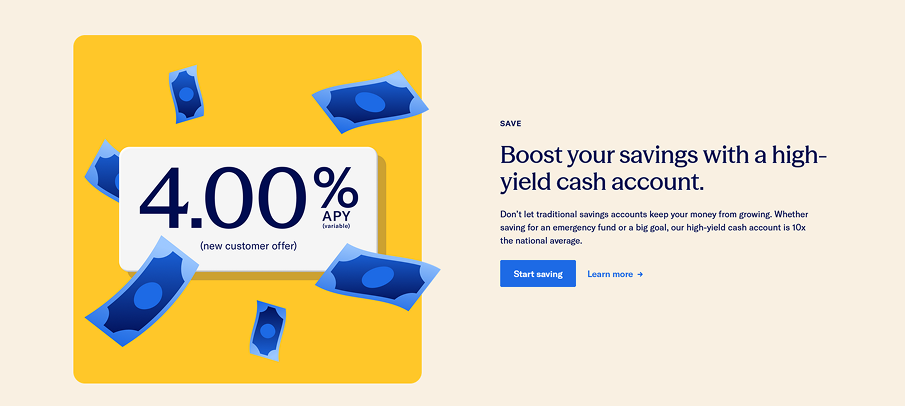 Yellow (opportunity)
 With betterman, I can see 2 colors that are the most used through out the page, Blue, Yellow. The colors have multiple variation based on the saturation, shades, but these 2 colors feels very credible - trustability.
Blue and yellow are doing different jobs but working in the same direction. Blue — specifically a saturated cobalt, not navy or sky blue — is the classic trust color in finance. It says serious, reliable, established. Yellow/gold carries a second layer of meaning in this context: money, growth, optimism. Together they answer the two questions any financial product needs to answer: can I trust you? (blue) and will I benefit? (yellow).
Notice the sequencing: blue dominates the hero (first impression = trust), then yellow takes over for the savings and retirement sections (second impression = opportunity). The palette doesn’t just look good — it structures the emotional arc of the page.
Stylized 3D Illustration
Dimensionality implies substance — volume signals depth and care.
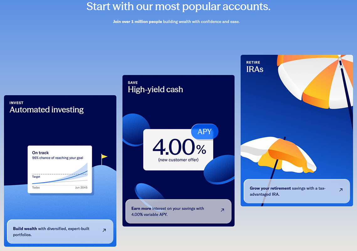 Product cards
 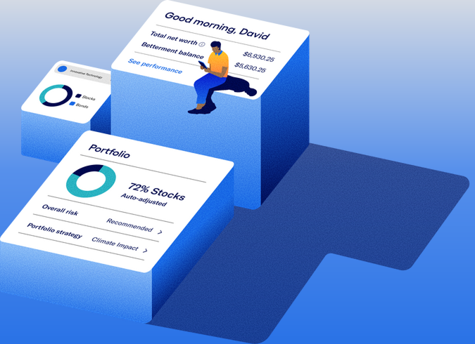 Dashboard
 3d illustration are cool. They creates depth, xyz axis kindathing, not static 2d => It exudes depth, thoughtfulness => this is particularly suitable where trust is the currency like money - finance and such.
Dimensionality implies substance. A flat 2D icon lives on the surface. A 3D object exists in space — it has weight, volume, a back side you can’t see. That subconscious read transfers to the brand: this company has depth, not just a surface.
3D illustration also signals craft and investment. A flat icon takes minutes; a rendered 3D scene takes hours. Users don’t consciously think this, but they feel it — “someone put serious work into this.” In finance, effort reads as carefulness, and carefulness reads as trust.
The specific style is worth noting: stylized and slightly cartoonish, not photorealistic. Bright saturated colors, simplified forms, exaggerated proportions. This prevents the 3D from feeling cold or corporate — dimensional enough to feel substantial, playful enough to feel approachable. The floating money bills are a good example: they make an abstract number (4.00% APY) feel physically real and abundant without being garish.
Overall
These 2 colors feels very credible - trustability. 3D illustration exudes depth, thoughtfulness — particularly suitable where trust is the currency like money - finance and such.
Every major design decision on this page points at the same problem: financial products are inherently abstract and anxiety-inducing. The blue/yellow palette, the 3D illustrations, the isometric dashboards — they all work to make invisible things feel real, weighty, and safe. The design isn’t decorative. It’s reassurance at scale.