Fey
How Fey uses three mechanically different scroll-driven animations — parallax exit, frame-swap typing, and logo-matched broker carousel — to make a single scroll section feel technically masterful.
Patterns extracted
The reusable payload — scan, then divePull Up & Fade Out
The opening move of the scroll-spy section.
 At rest
  Mid-scroll
 First thing I see is the scroll-spy pattern. As we scroll, the illustration is like pulled up and faded out.
The pull-up-and-fade is the classic parallax exit: the illustration moves faster than the scroll speed, creating depth as it disappears above the viewport. Fading while translating softens the cut — it feels like the content is being swept away rather than abruptly replaced. It primes the user for the next thing without jarring them.
Frame-Swap Text Fill
Scroll-linked text reveal tied to reading pace.
 Empty state
  Mid-fill
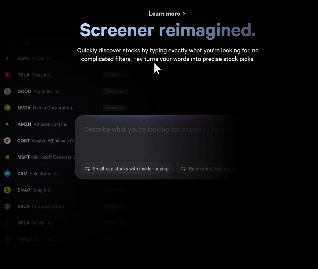
 The second illustration — as pulled up, the text are typed and filled the sentence there. Not sure what the trick to do that here? Like as we pull they swap a new frame but very cool.
This is a scroll-linked text reveal — most likely implemented by snapping through pre-rendered frames (or CSS clip-path/mask) tied to scroll position. Each pixel of scroll maps to a new state of the sentence, making it feel like the text is being typed in real time. The illusion works because the rate of reveal matches human reading speed at a comfortable scroll pace — it feels responsive to you, not like a canned animation.
Logo-Sourced Accent Color
Every integration gets its own color identity.
 Schwab
  Robinhood
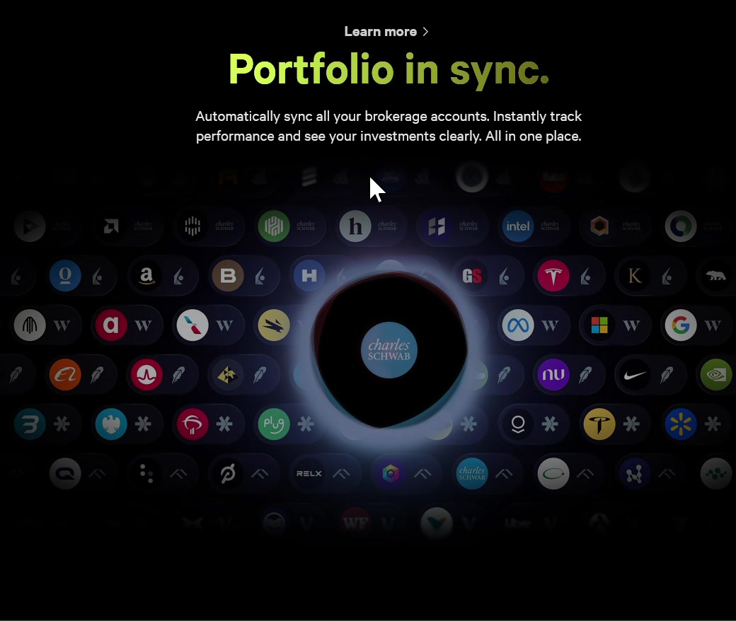
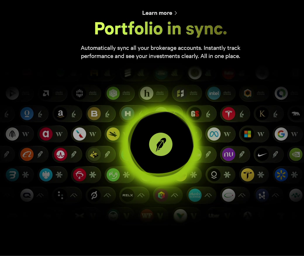
 Last illustration is masterful — it’s an interval to show what broker that they connect to. The color of the edge of the circle changes based on the main color of the logo of the shit. The background is carefully chosen to blend-in with the dark theme. The big title changes its brightness from very bright to very dark starting from left to right — pretty niche trick. Not sure what the purpose here. But these are sure well-thought out.
The broker carousel does three things at once. First, the logo-matched ring color is a subtle trust signal: it shows that Fey has a real, considered relationship with each broker — not a generic integration list. The accent color says “we know who these are.” Second, the background blending keeps the dark base theme from fighting with each logo’s color palette; the background shifts to complement rather than clash, which is why each state feels cohesive instead of garish. Third, the left-to-right brightness gradient on the title is likely a visual pacing cue — the eye reads from bright (high contrast) to dark (fading out), subtly directing attention leftward toward where the next interaction begins.
Overall
These are sure well-thought out.
Fey’s scroll-spy section is one of the more technically ambitious marketing sections you’ll find on a SaaS landing page — each illustration does something mechanically different (exit, fill, cycle) while the scroll gesture ties them into a single unbroken experience. The care in the details — color-matched rings, tuned backgrounds, brightness gradients — signals that Fey is a product for people who care about precision. The design is doing the same thing the product does: making complex financial data feel polished and in control.